3D Periodic Table Model
by Roy Alexander
Who knew?
I never realized how easy is would be to teach with my 3D periodic table until I started listening to a science teacher at last year's NSTA.
She recognized that the
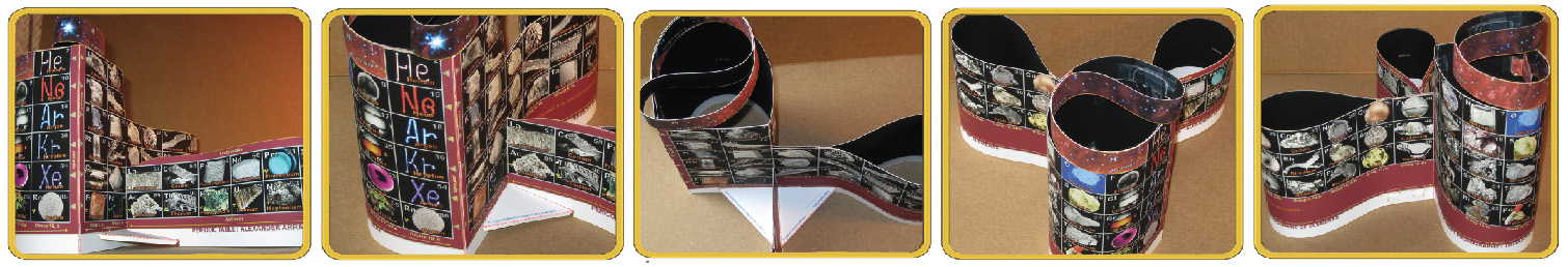 AAE (for the Alexander Arrangement of Elements) she was walking over to at my lunch table was pretty much the standard chart: rolled and folded (I knew that) and that the common 2D element arrangement is the same thing unrolled and unfolded with the familiar separations and multi-gaps. (I knew that too: it's what I started with when fixing the gaps that annoyed me so much.)
She (Allison) said that she'd had to make her own 3D periodic table ever since her professor showed her how much better it is for introduction of the idea for middle and high school students. That's when I began to get a glimmer of its usefulness in the classroom - beyond the motivation of novelty and appeal of the logic I used to develop it!
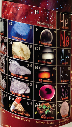
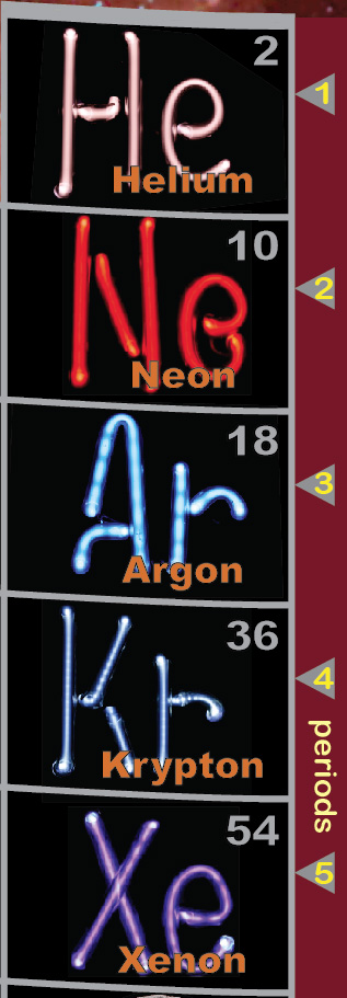
The photos, she told me, bring reality to the common abstract chart, and are a terrific way to have the least academic of her students to immediately identify where metallic elements are, and by seeing, for instance, the Noble Gases looking like downtown at night.
She pointed out that the Main Group element's ability to stay as a unit all the way to the last period would make her job of teaching trends simpler - as they are most obvious that way.
(I had NO idea!)
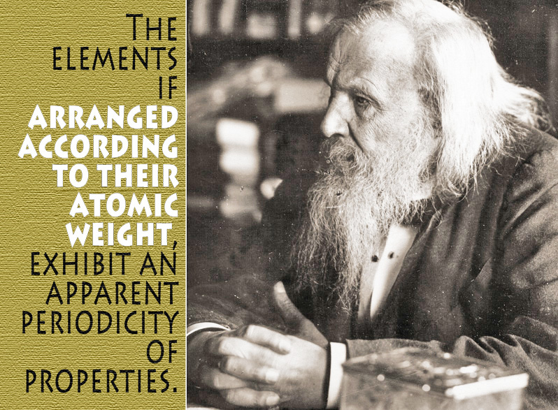
Earlier I'd learned that although Mendeleev got only half of his missing element predictions correct, being the first to leave space for the undiscovered was pretty gutsy, giving him the right to state "...the elements if arranged according to their atomic weight..." in his Periodic Law.
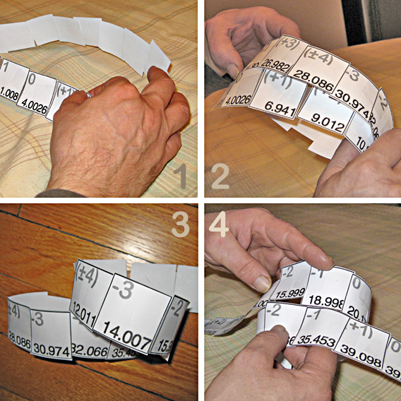 Months later we got together and decided that our first lesson would be to provide students to interactively apply their own hands-on effort and brains-on logic to build their
personal solution to how a periodic table should be - starting by making an element 'ribbon' scotch taped 'arranged in order'.
Months later we got together and decided that our first lesson would be to provide students to interactively apply their own hands-on effort and brains-on logic to build their
personal solution to how a periodic table should be - starting by making an element 'ribbon' scotch taped 'arranged in order'.
This would be followed by figuring out how to tape elements together by properties without cutting the ribbon, as that, of course, would bring back the dozen breaks at period ends and the big middle gap.
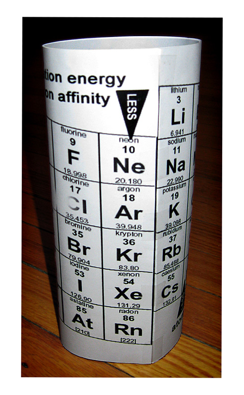
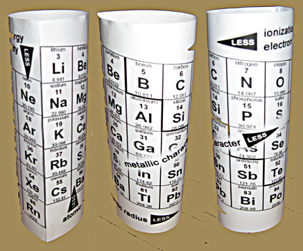 Then we needed a
trends chart - 3D of course - to replace the old ones with the big arrows and the d-block spreading the trending elements apart. Ours shows elements with the least and most ionization energy
one element apart, on either side of the element that each would like to become - instead of at opposite ends of the chart.
Then we needed a
trends chart - 3D of course - to replace the old ones with the big arrows and the d-block spreading the trending elements apart. Ours shows elements with the least and most ionization energy
one element apart, on either side of the element that each would like to become - instead of at opposite ends of the chart.
The brand new Randomized to Organized lesson and lots of support material (jumbled element data boxes, trends tube, three part PT history slides, and more about the early developers) are HERE for you to download.